What changes when data goes on paper?
DataInk is an exploration of turning everyday data into a carefully composed visual object: something that still explains itself after the dashboard is closed.
The original April 2025 plan began with CSVs, spreadsheets, and activity exports, then a small choice of visual forms: sparklines, slopegraphs, and dot-density compositions. A person would choose a motif, edit the palette and annotations, and export an SVG or PDF. A printed object was part of the idea.
Status · September 2026: concept and design exploration. There is no print-ordering service here. The composition below is a new study for this site, using real data from another project.
One dataset, one question
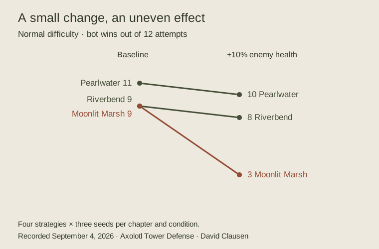
The study uses a slopegraph because the important thing is the change. Direct labels keep the chapter names next to their values. A fixed denominator—12 attempts—makes the comparison legible. The steep Moonlit Marsh line tells us where to look, while the caption tells us what experiment produced it.
A print cannot rely on hover text to explain what “wins” means. Without the words “bot runs,” the graphic could easily be mistaken for human playtest data. Without the perturbation label, it could look like a trend over time. Those small omissions would make the composition cleaner and the evidence worse.
Open the printable SVG · Download the data · Read the experiment
The design question
I’m interested in what is worth keeping when interaction disappears: a meaningful selection, a scale that can be read, and enough context to resist a plausible misreading. Tufte’s influence on the project is in that attention to information and composition.
My next useful test would be to give the image to someone without the accompanying page and ask what they think it says. If the answer changes the experiment, the design is not finished.